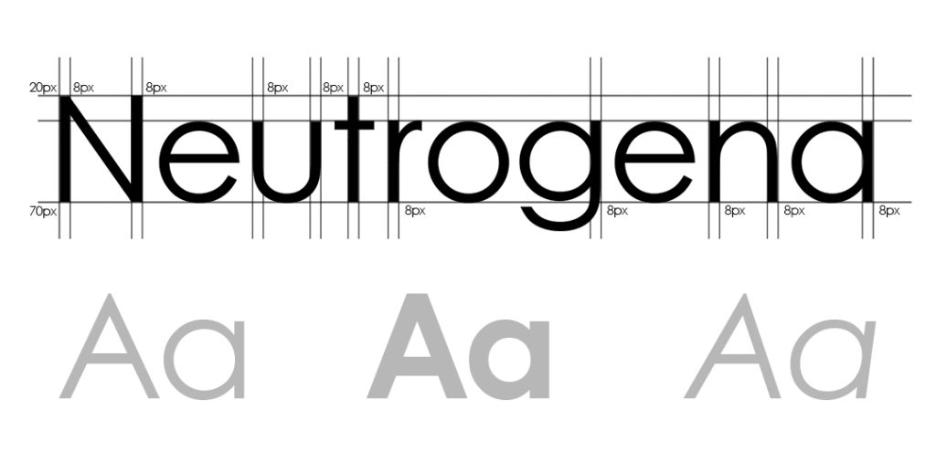
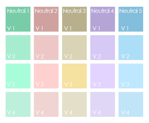
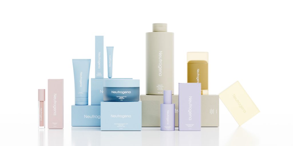
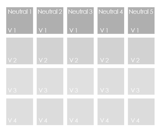
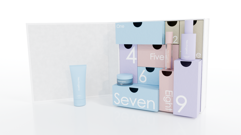
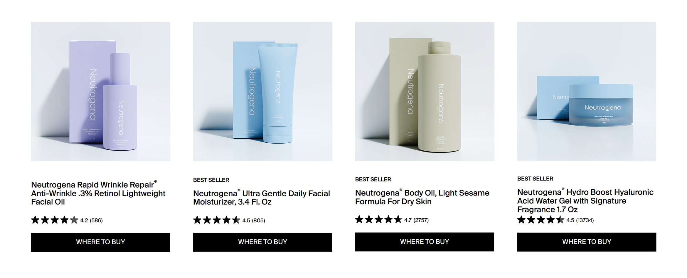
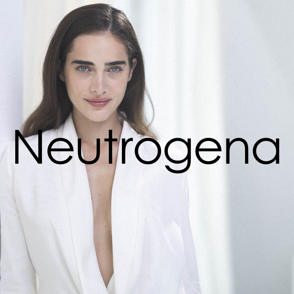
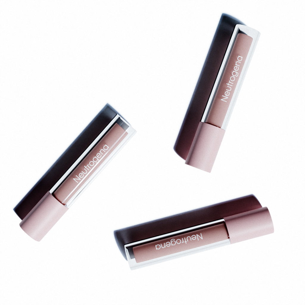
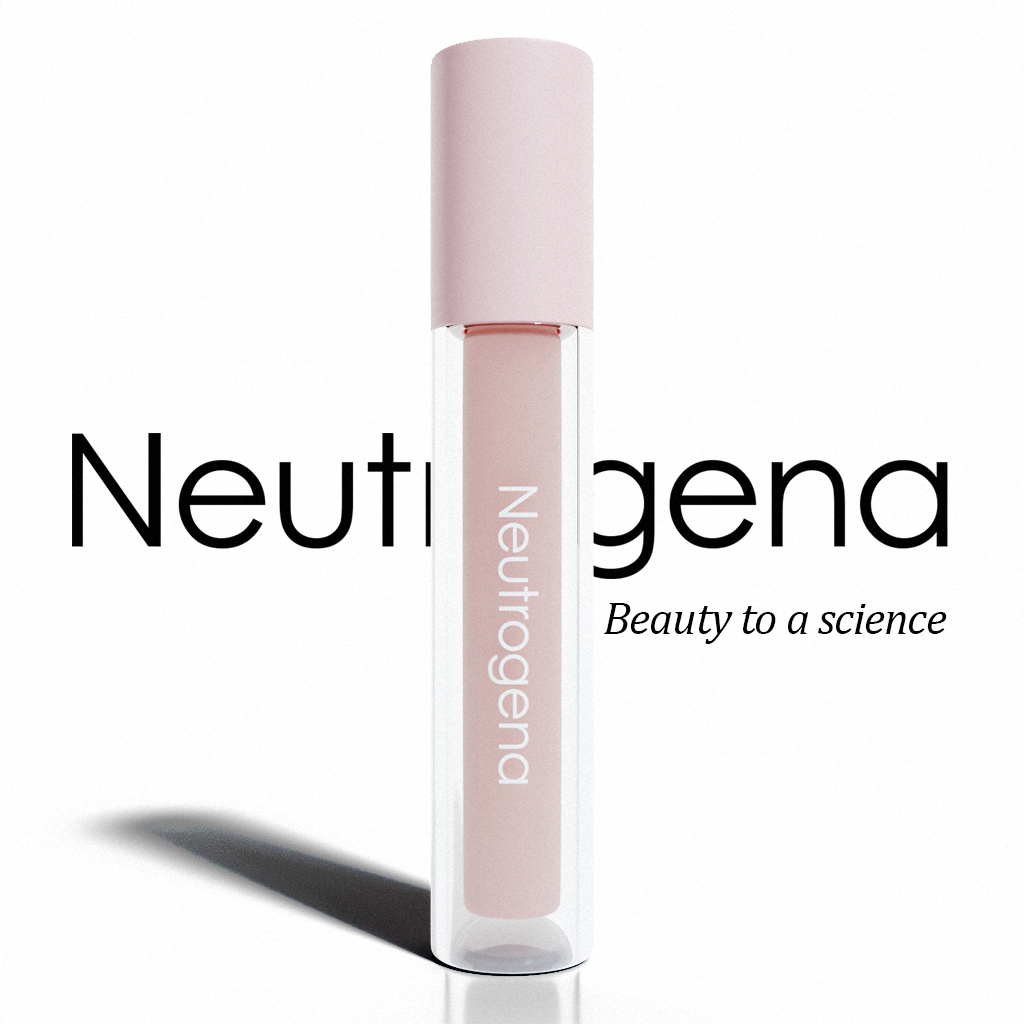
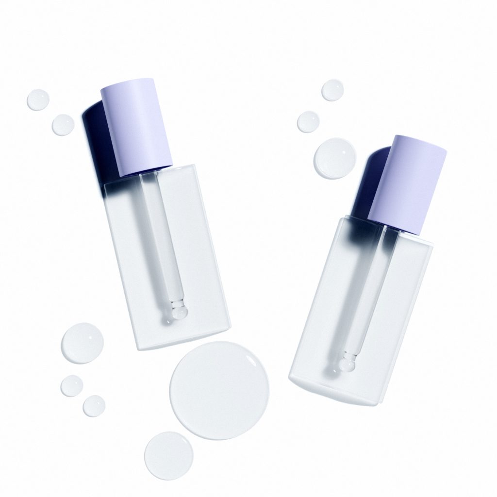
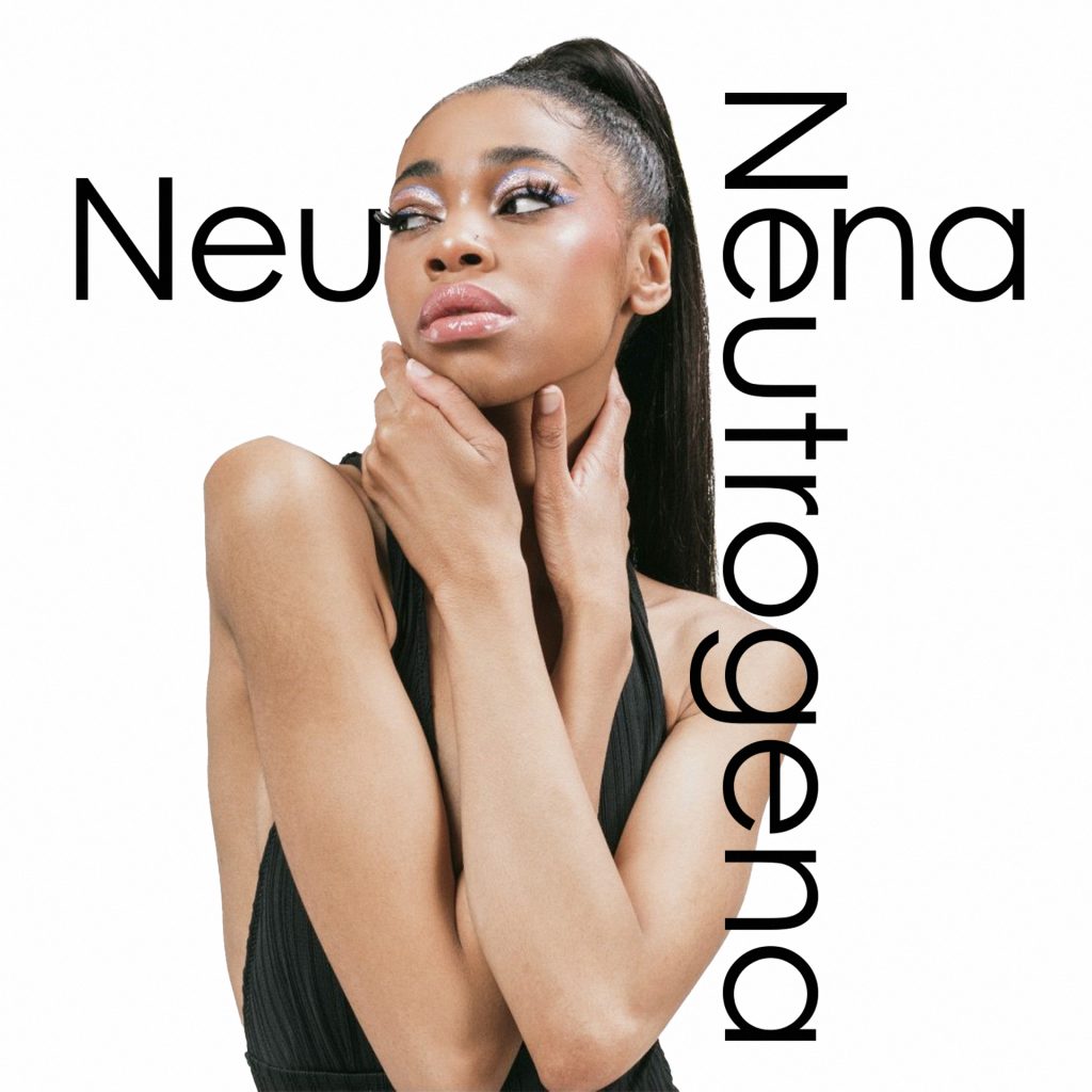
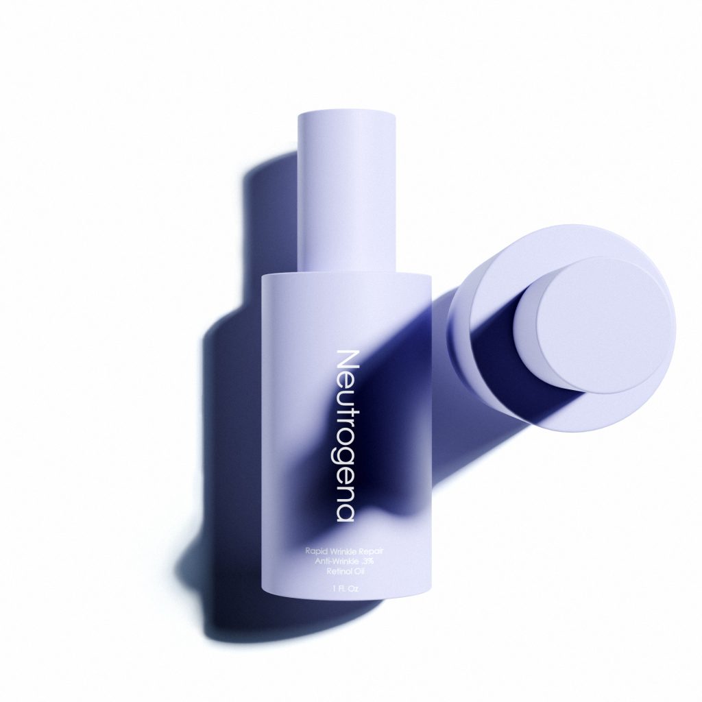
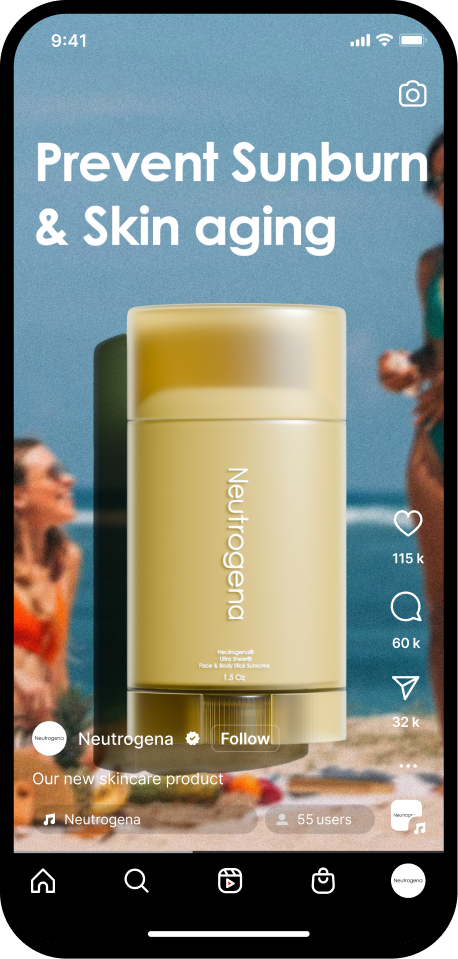
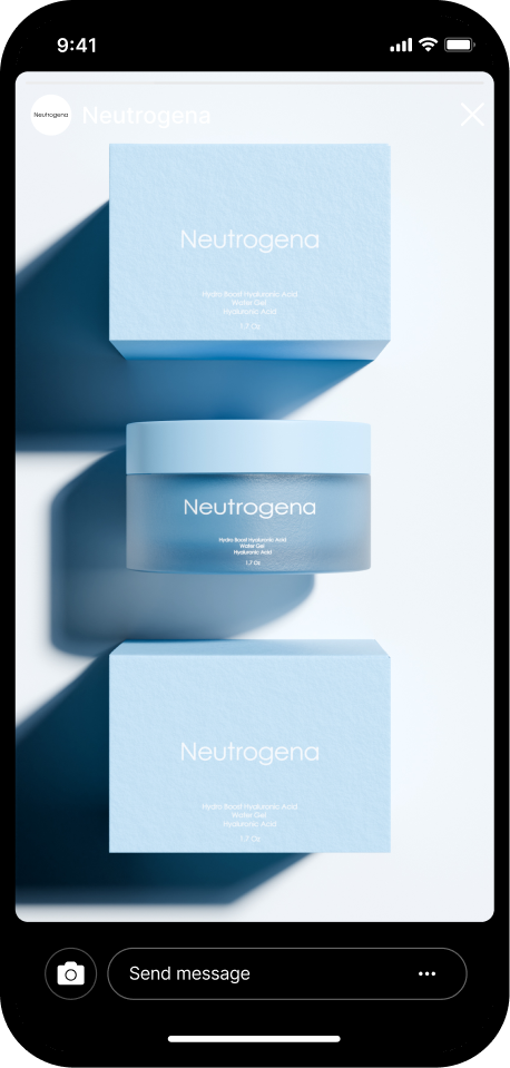
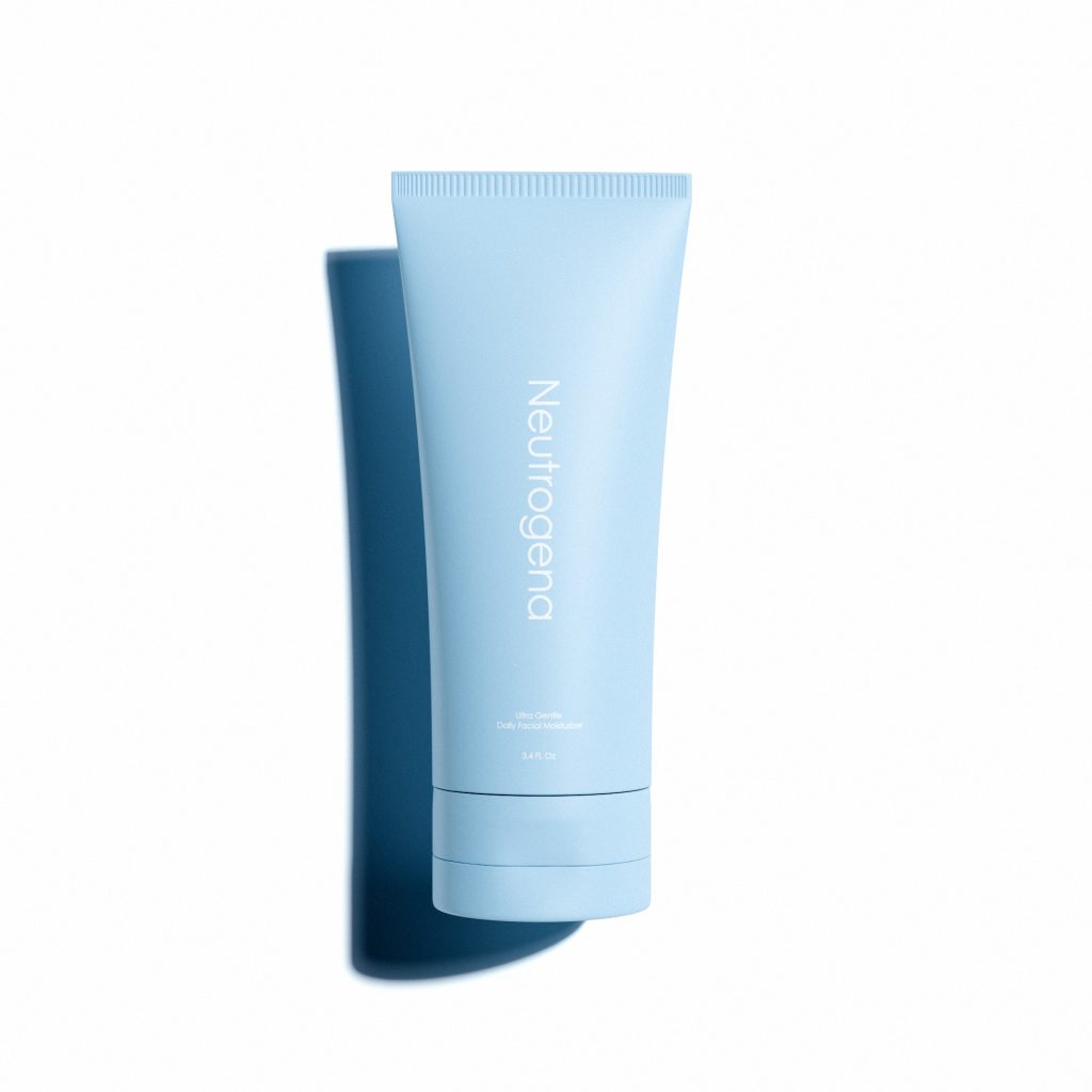
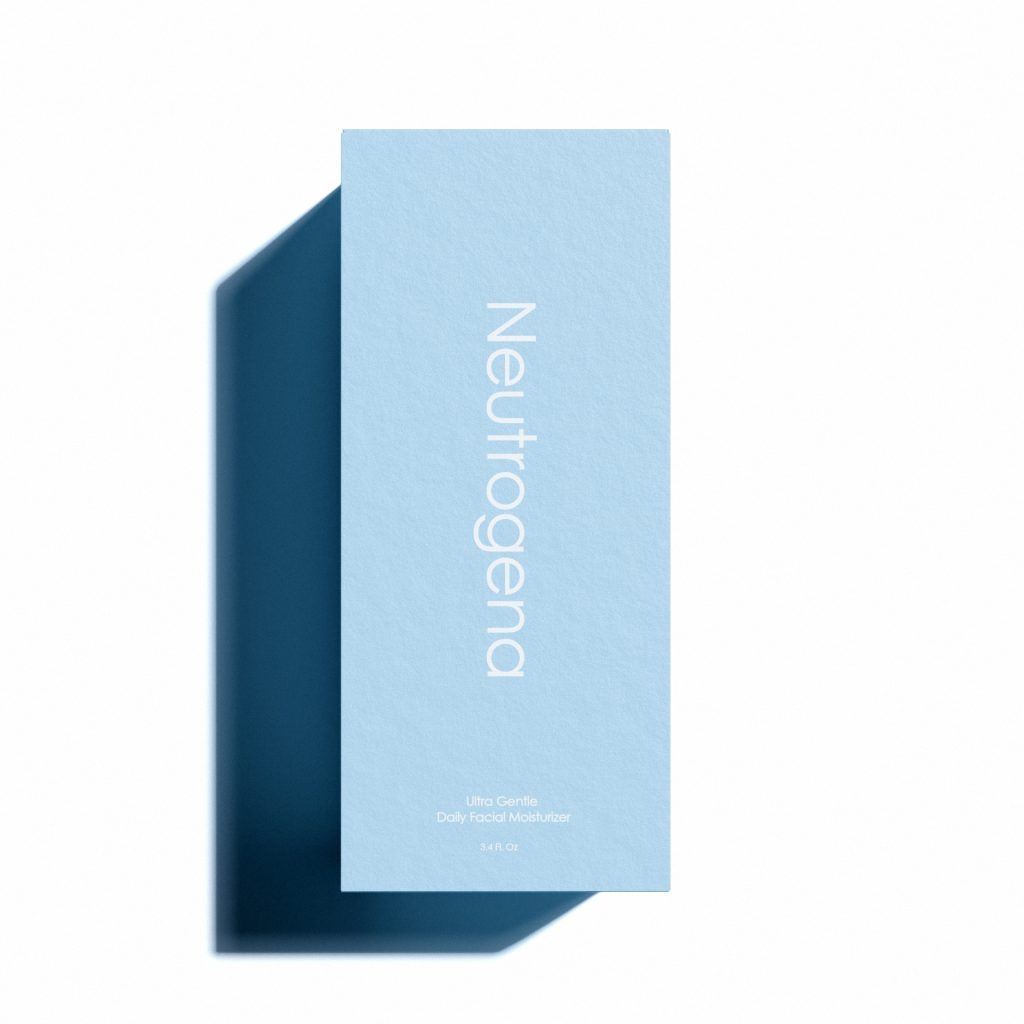
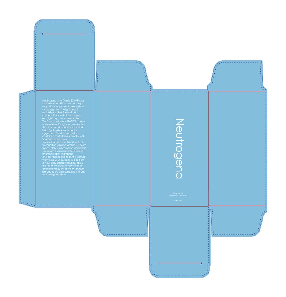
I redesigned Neutrogena’s product and packaging system with a minimal, neutral aesthetic grounded in the brand’s balanced pH and science-first identity. I created a cohesive color system with controlled luminance, a precise geometric wordmark, and packaging that uses soft tones, clean geometry, and minimal typography for a calm, modern look. I also integrated sustainable materials such as PCR plastic tubes, recyclable mono-material caps, and FSC-certified cartons, supported by efficient dielines that reduce waste. The result is a unified brand system that reflects balance, simplicity, and environmental responsibility.
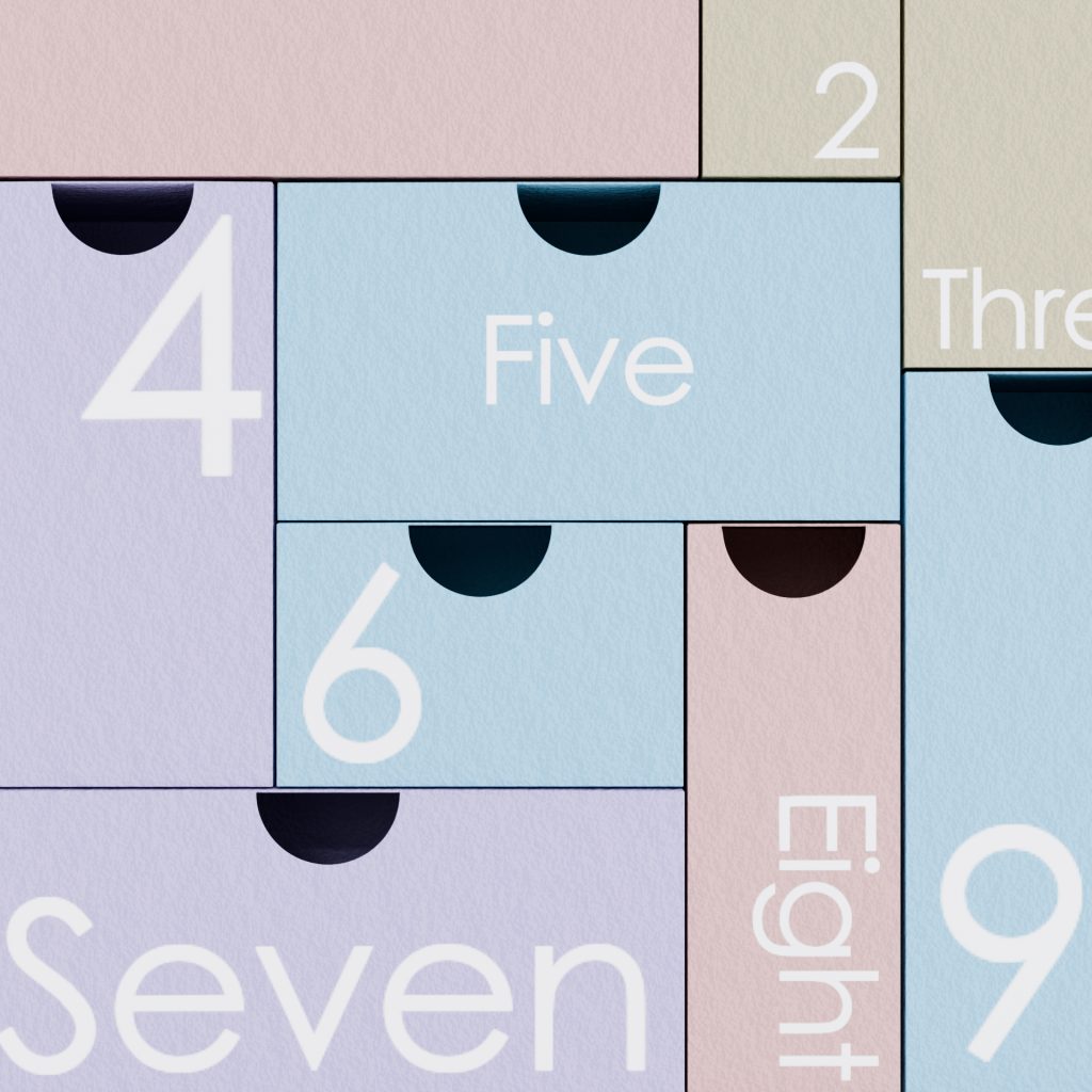
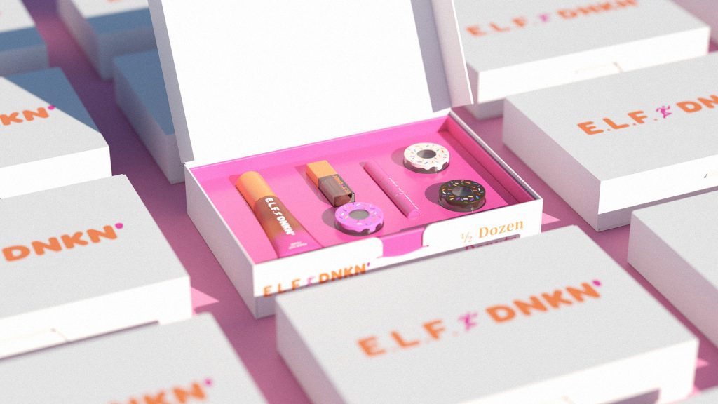
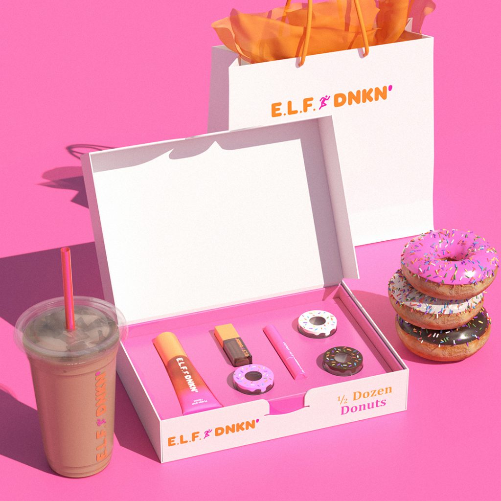
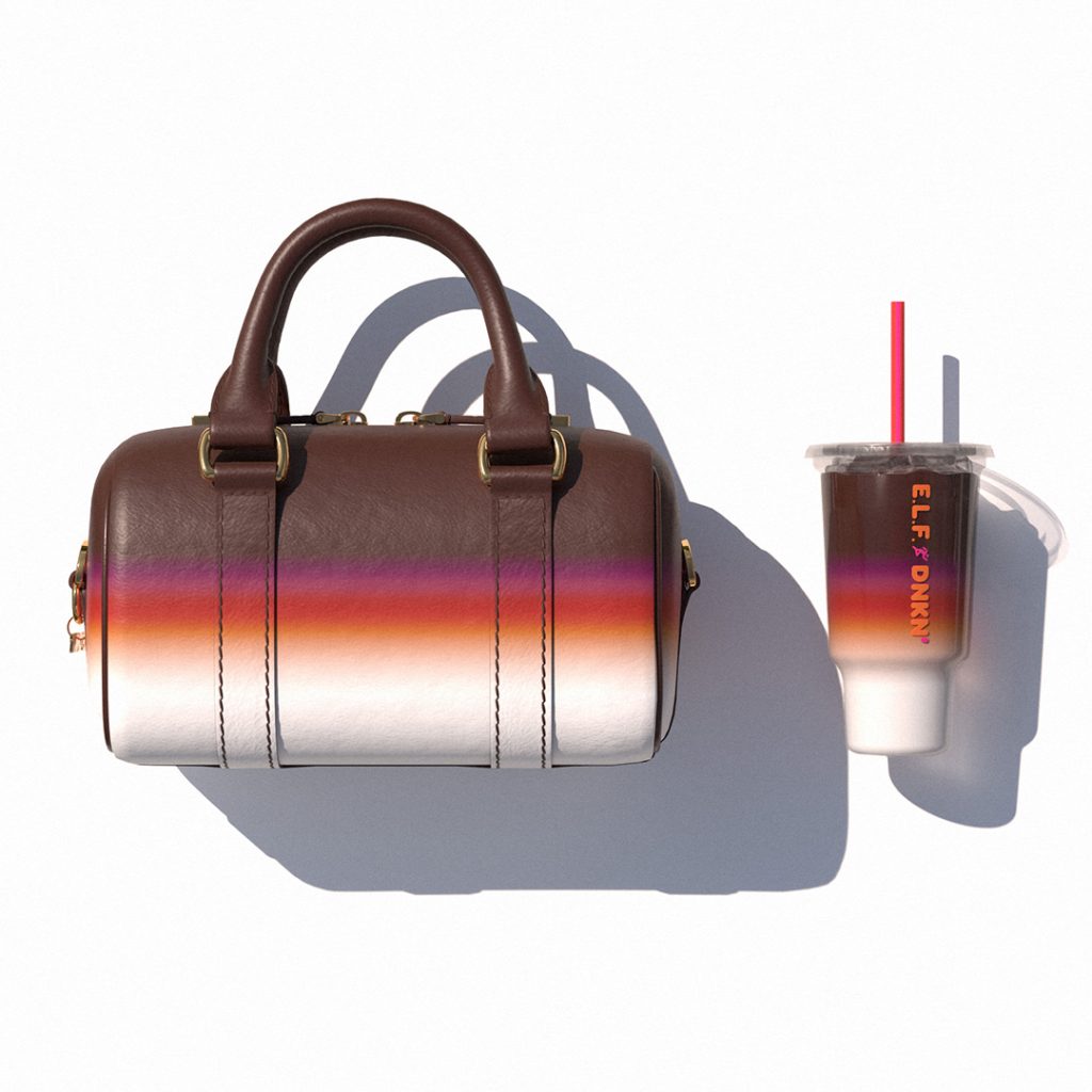
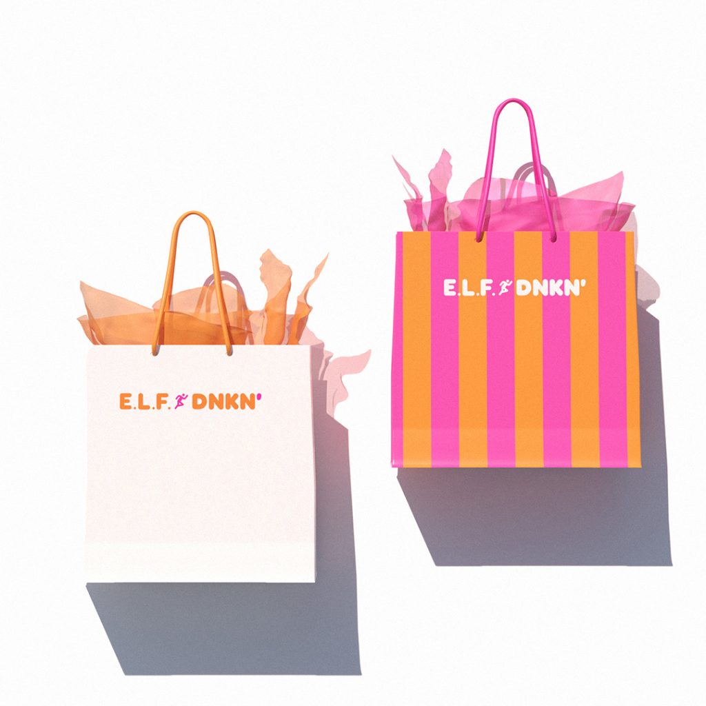
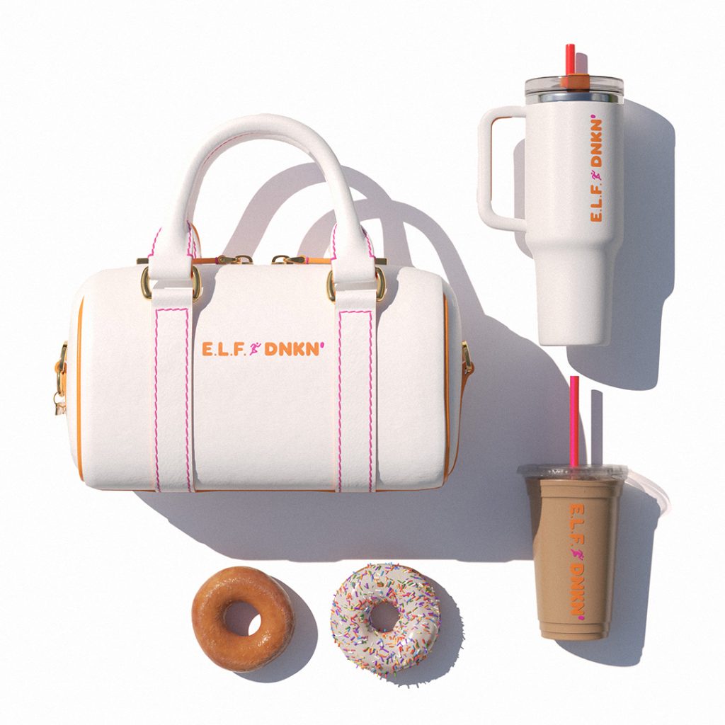
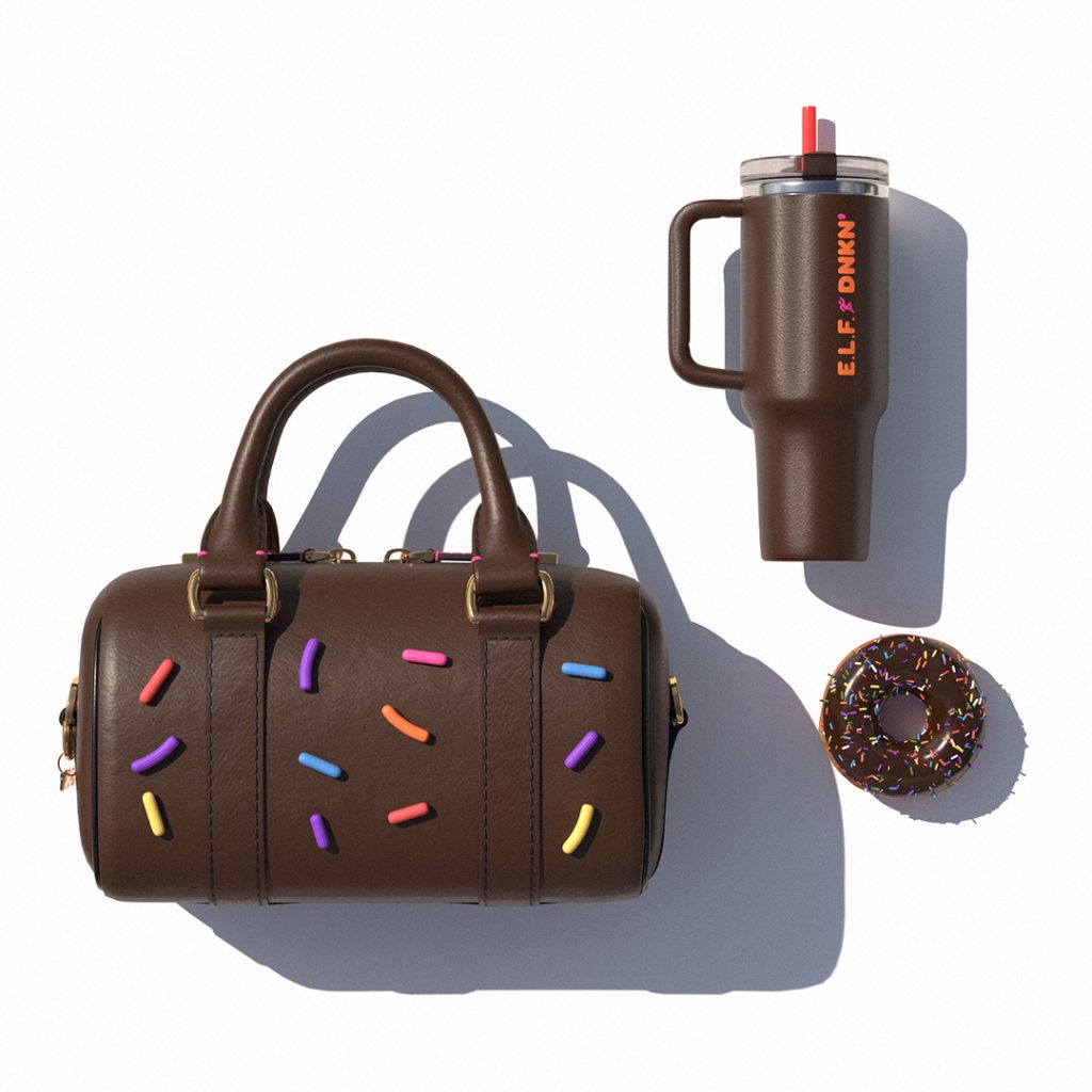
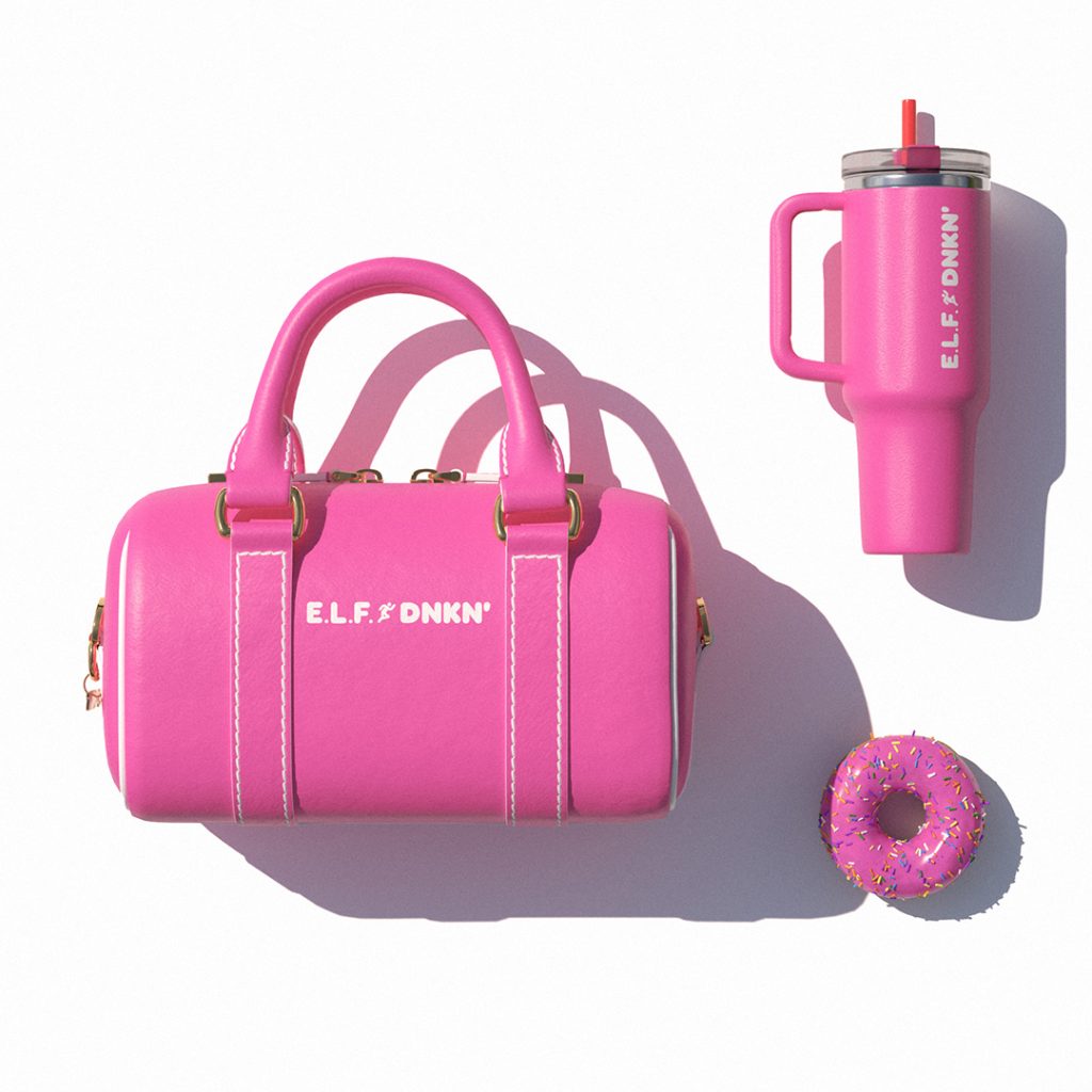
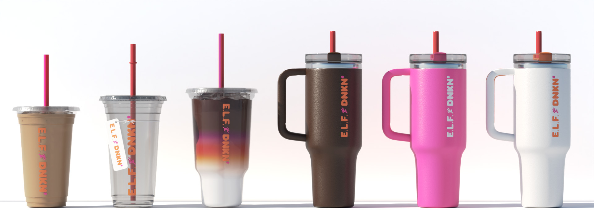
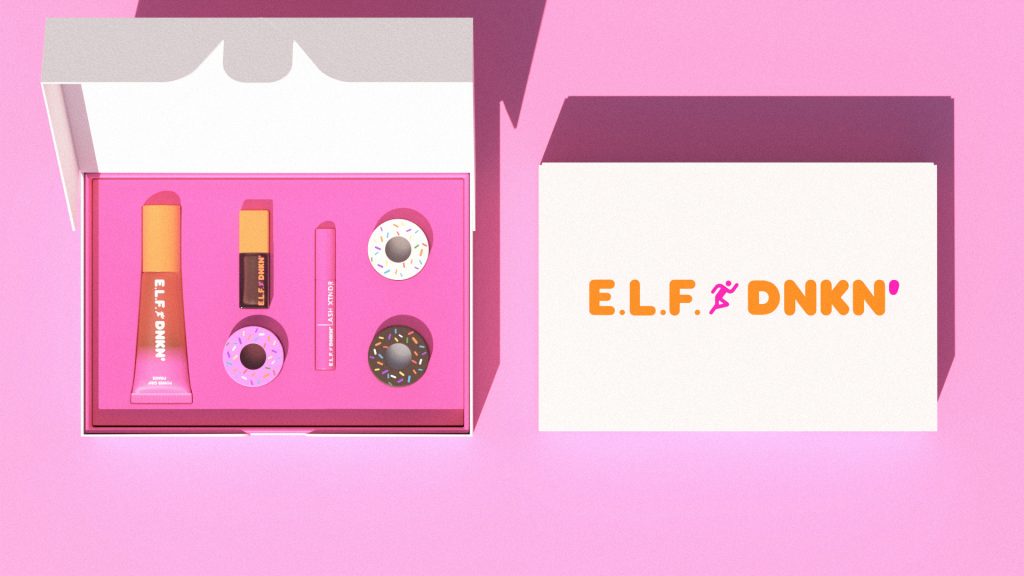
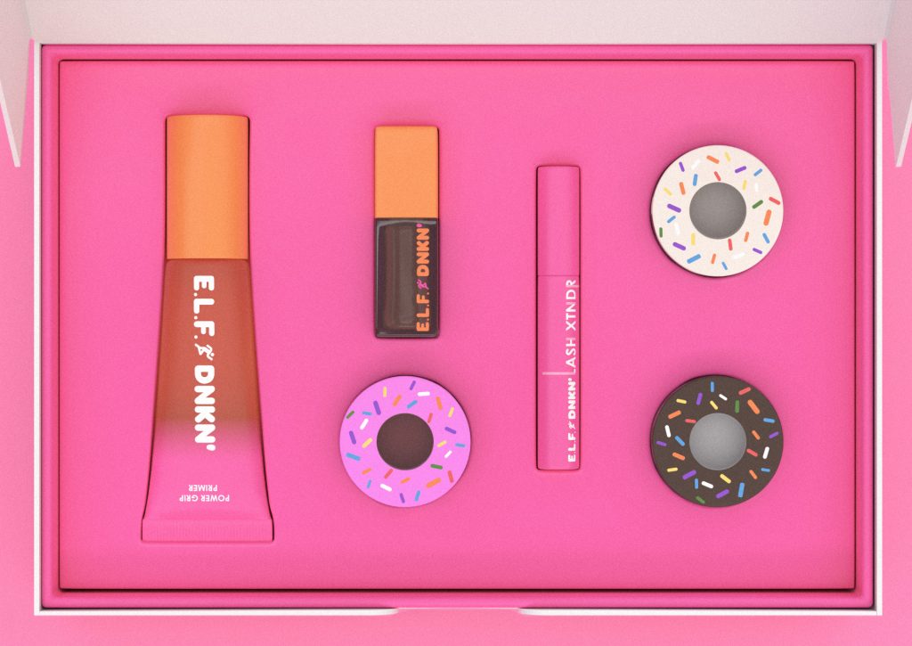
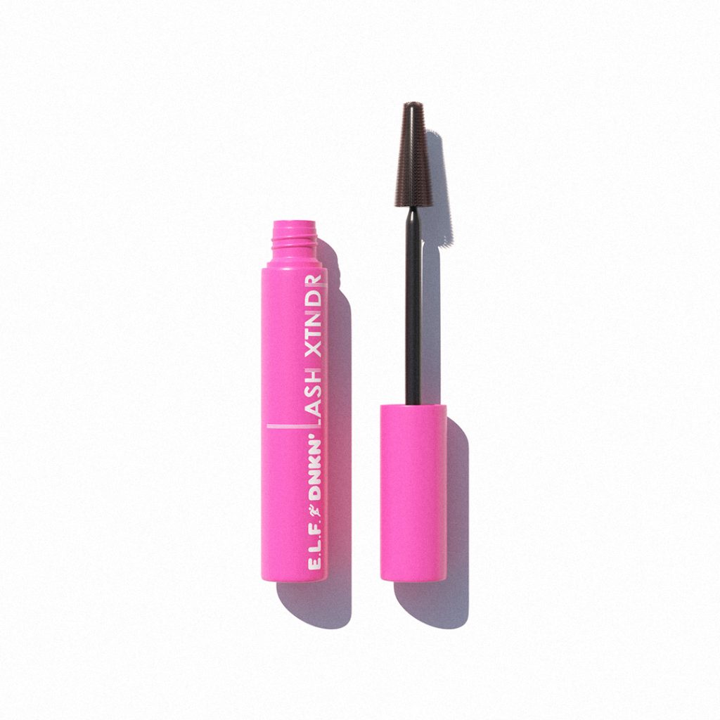
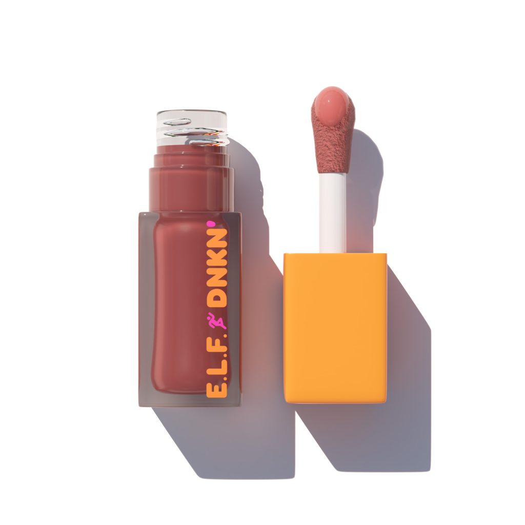
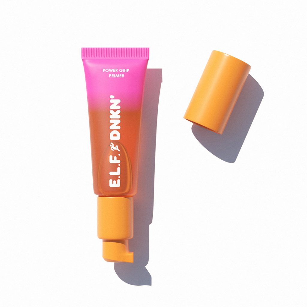
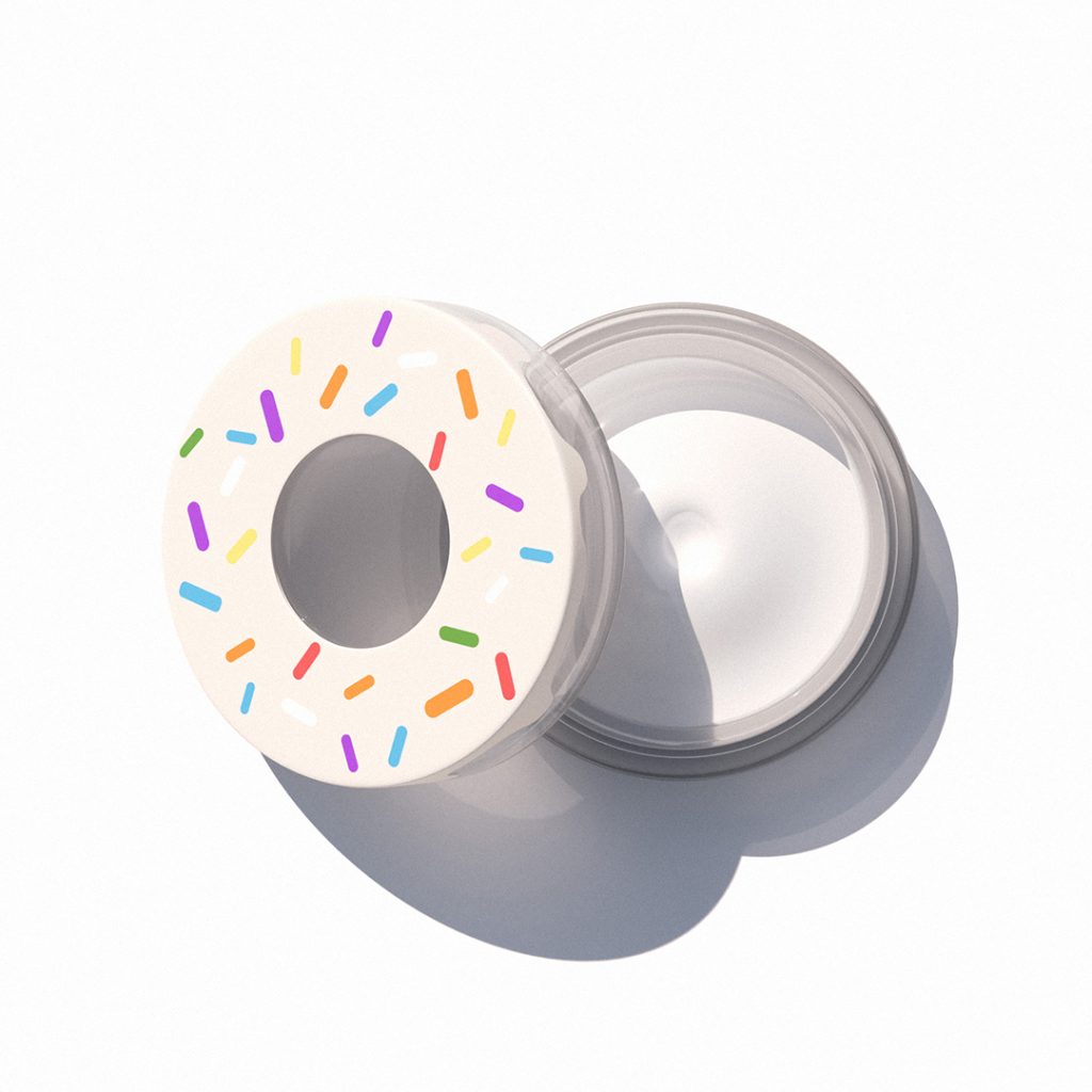
Half a Dozen is a beauty collaboration inspired by the daily ritual of stopping at Dunkin for your morning coffee. The concept takes the idea of a “half dozen” box and transforms it into a curated set of six everyday beauty essentials designed to fit seamlessly into a busy routine. Just like grabbing your usual coffee order, these products are meant to be quick, reliable, and part of your daily habit.
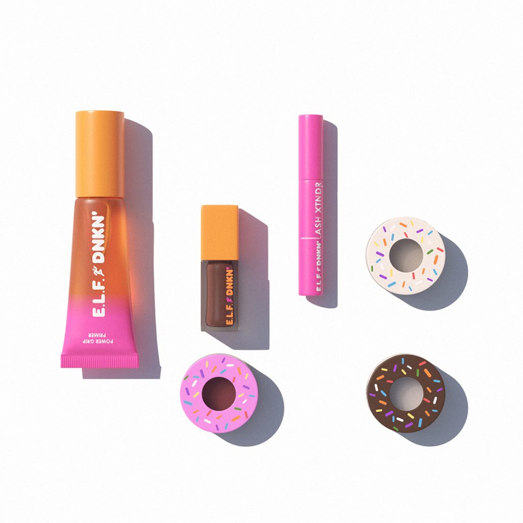
Mascara Tube
Materials:
Bottle: PP (polypropylene) or PETG (glossier look)
Stem: PP
Brush: TPE (thermoplastic elastomer) or nylon
Cap: PP
Lip Gloss
Materials:
Bottle: PETG or PMMA (clear, premium-looking rigid plastic)
Cap: PP
Wiper (inside neck): LDPE
Applicator wand: ABS or PP
Flocked doe-foot tip: nylon or polyurethane flock
Primer Tube
Materials:
Tube body: PE (LDPE or MDPE) standard for flexible squeeze tubes
Gradient finish: printed or sprayed decoration
Pump + collar: PP
Cap: PP
Internal pump spring: stainless steel
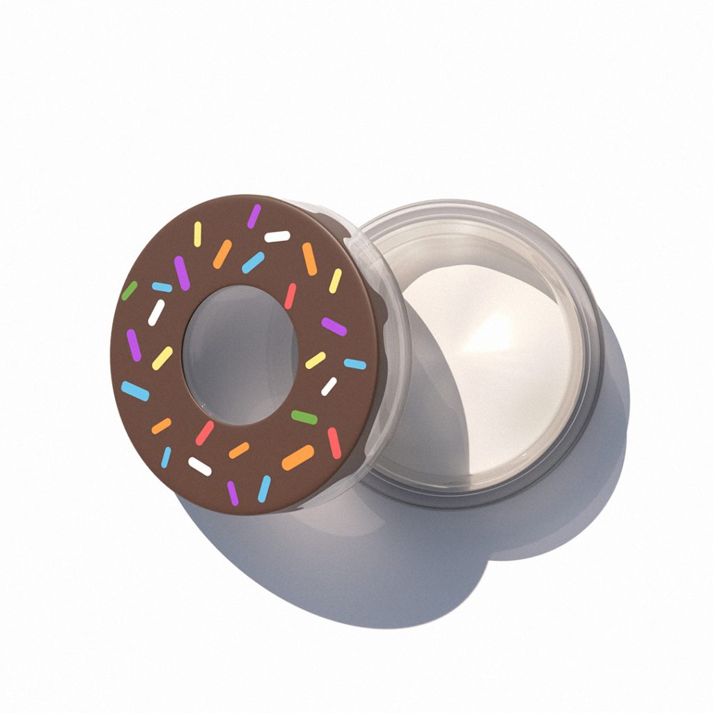
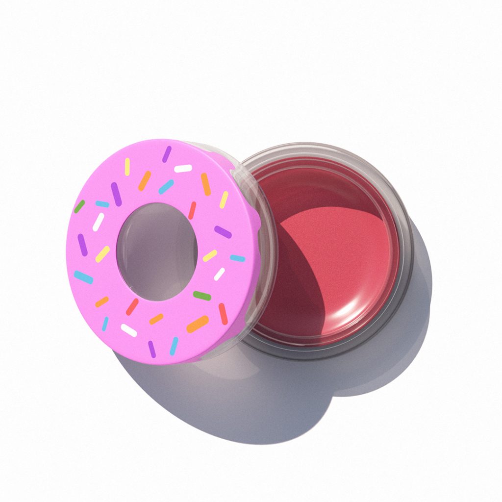
Blush Jar
Material options:
Clear disc: PETG, SAN, PMMA
Outer lid: PP or ABS
Pad-print the outer ring.
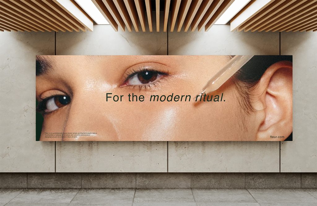
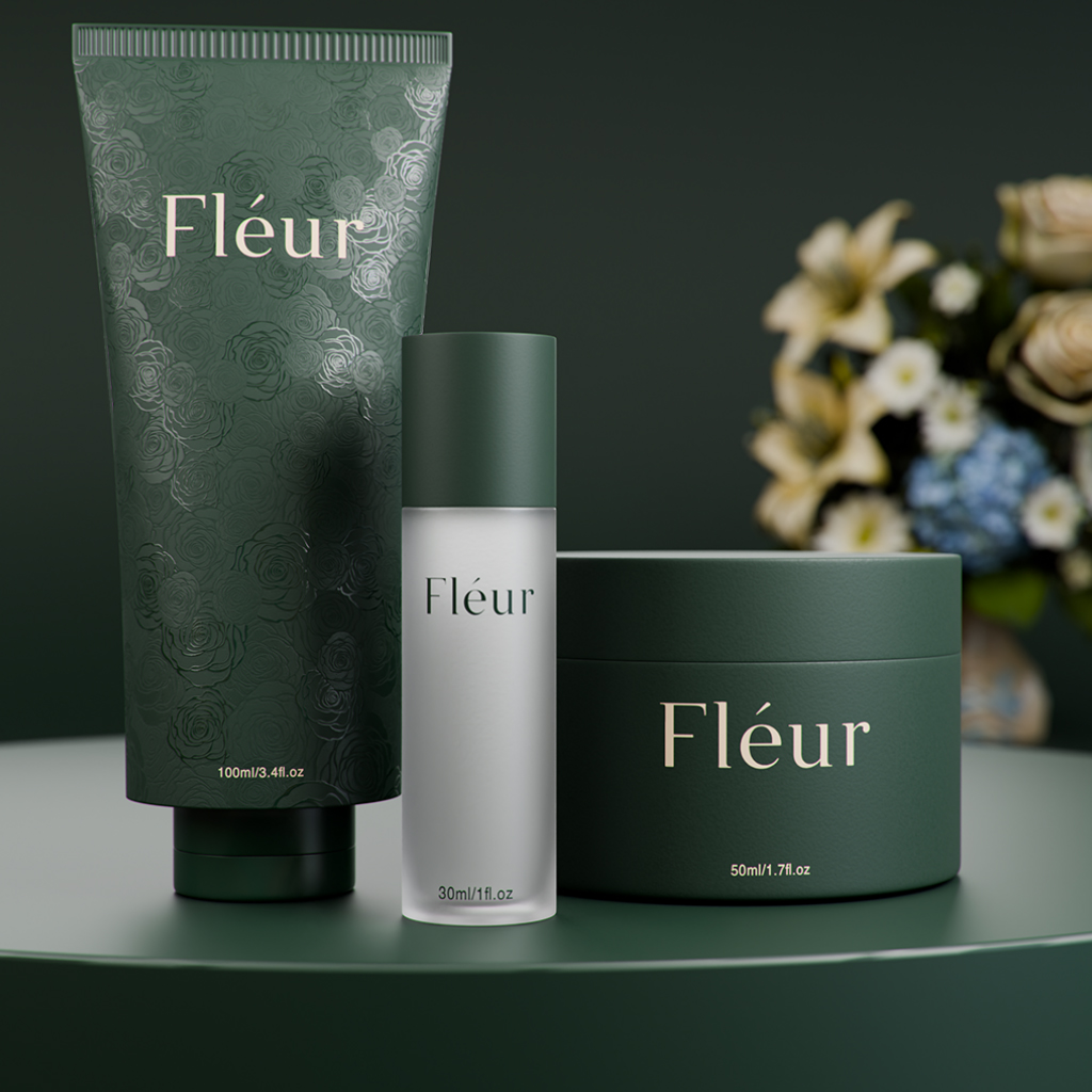
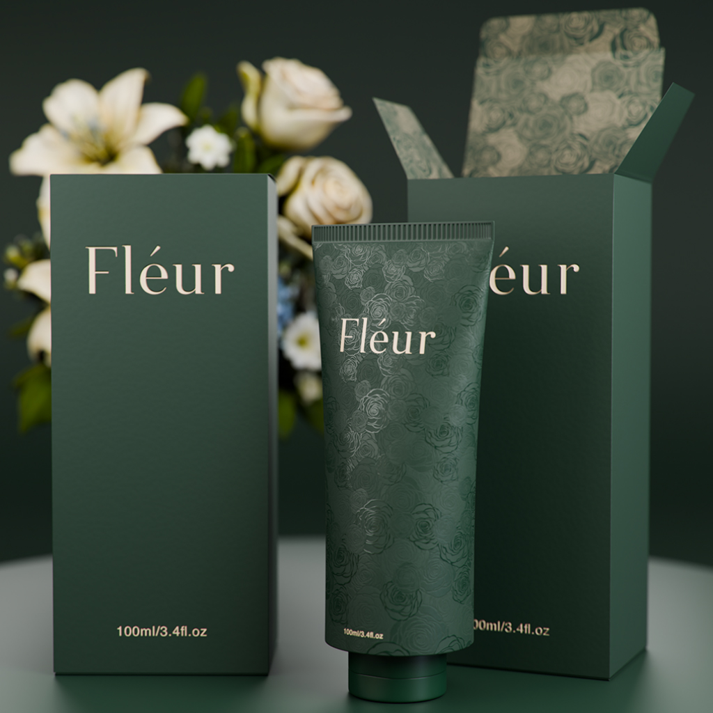
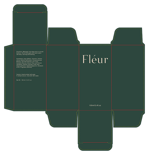
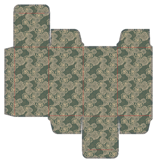
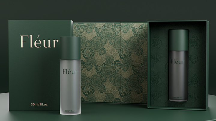
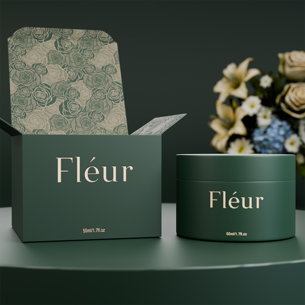
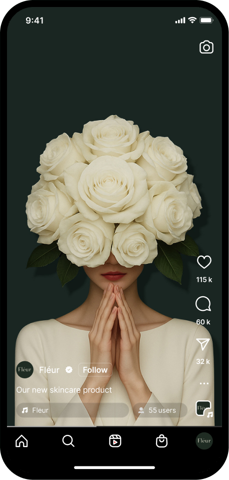
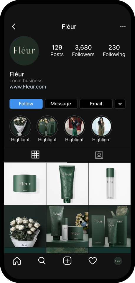
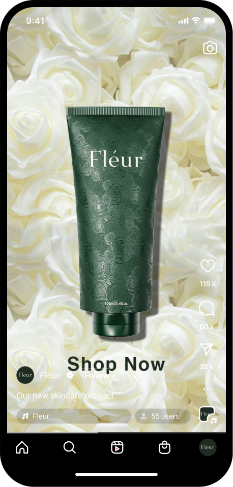
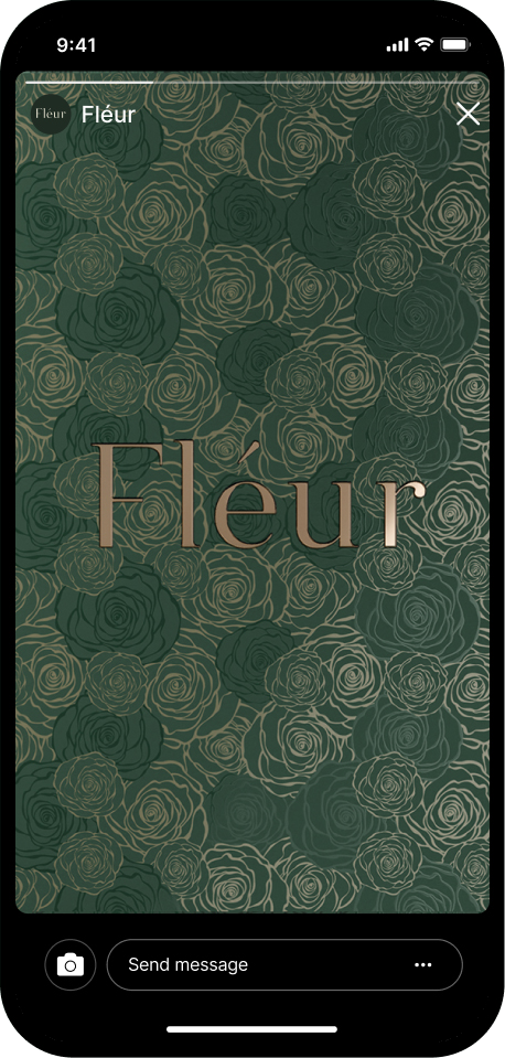
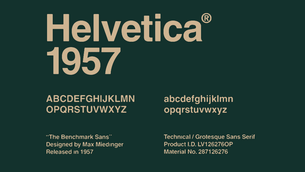
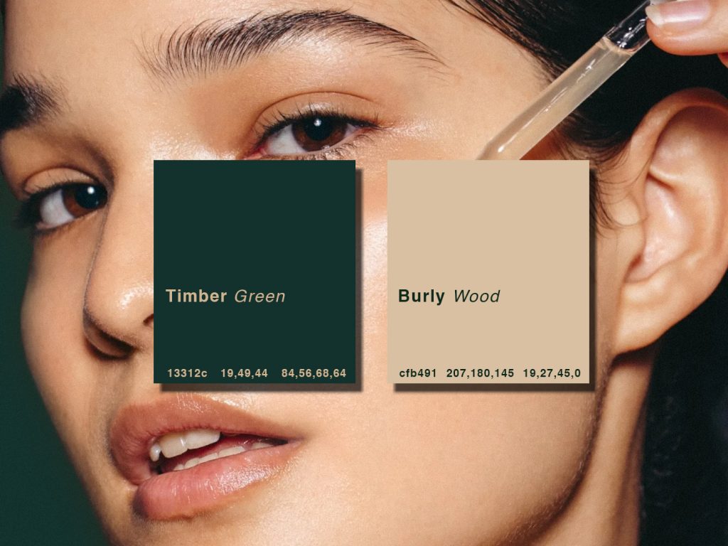
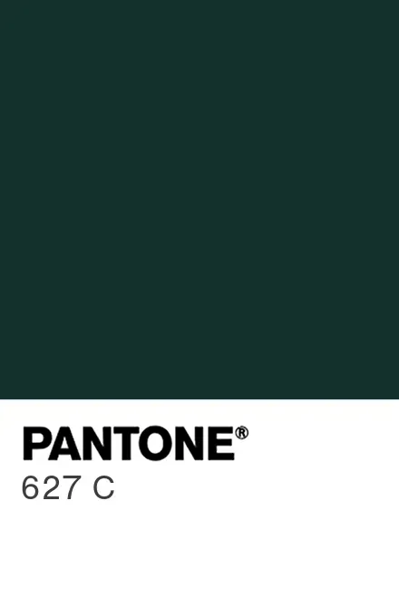
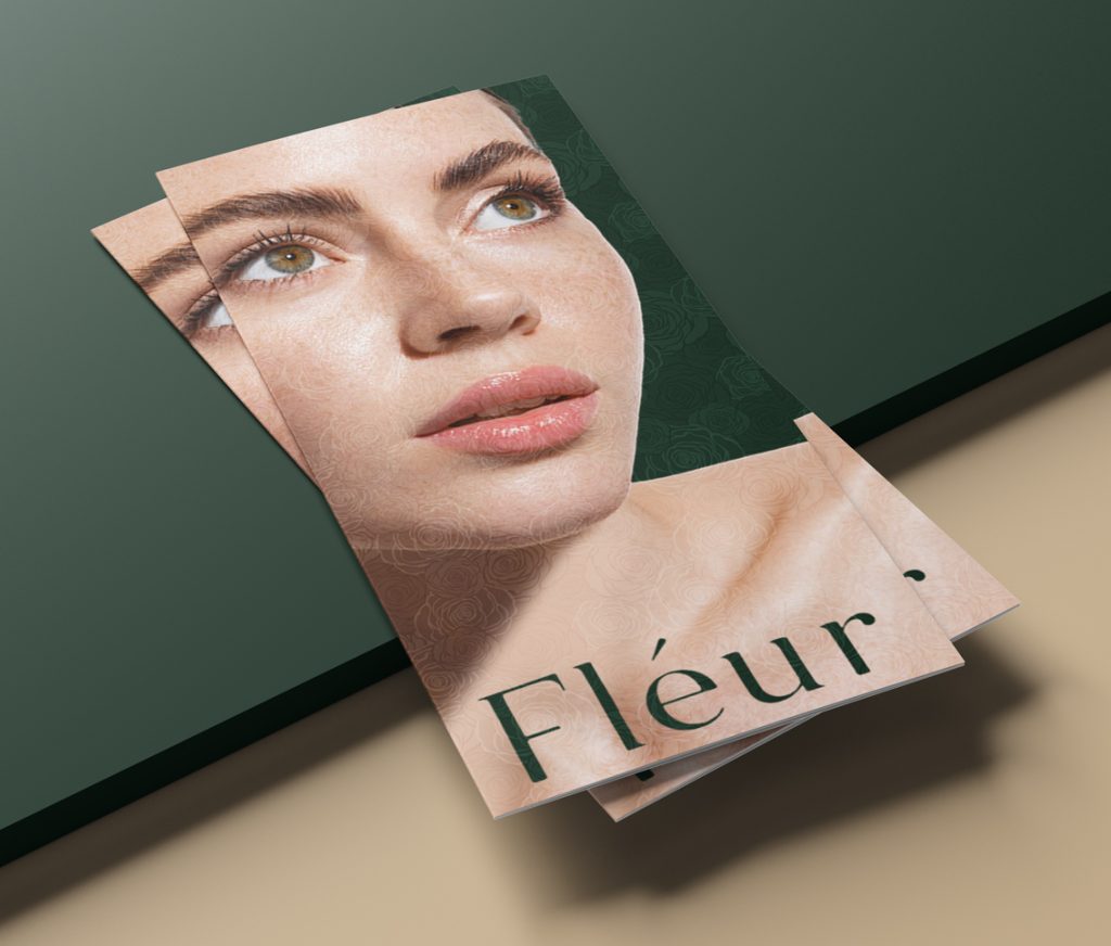
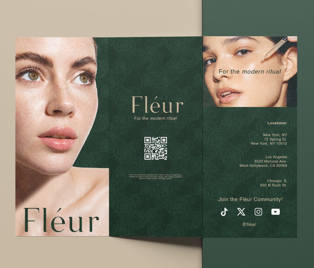
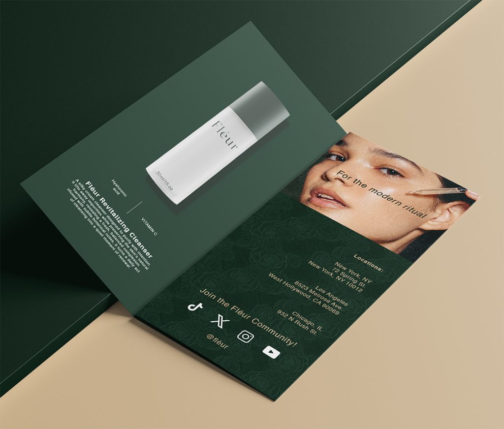
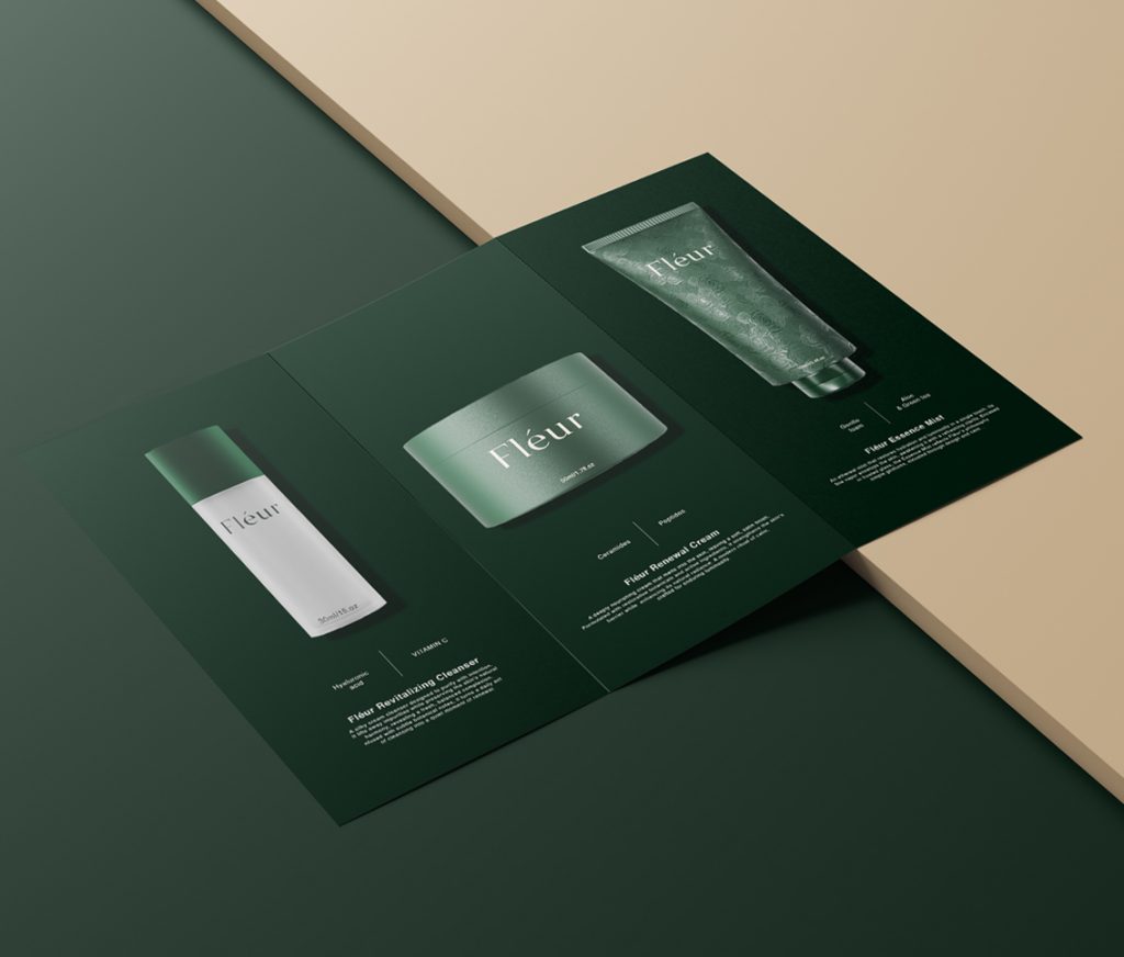
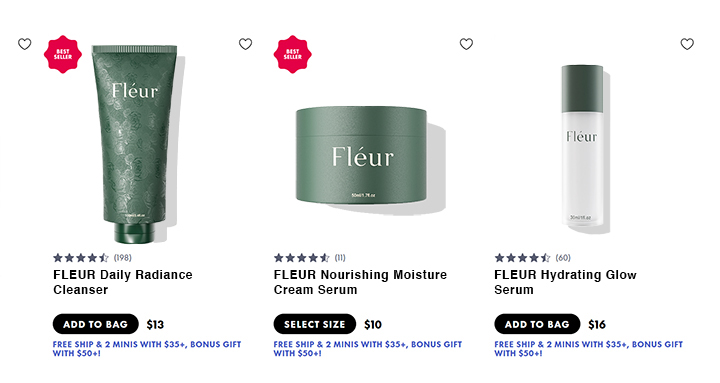
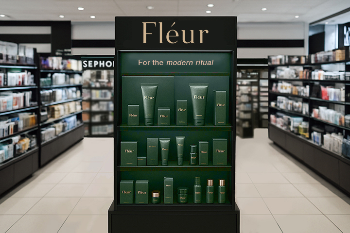
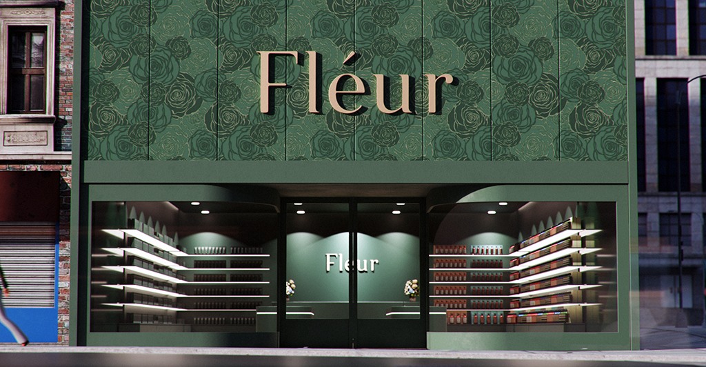
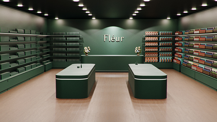
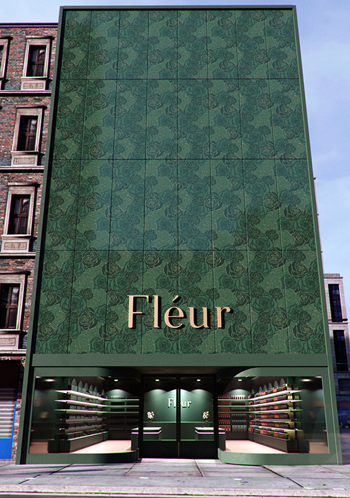
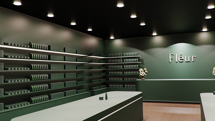
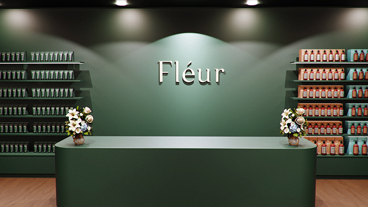
I developed Fléur as a skincare concept that blends a natural aesthetic with quiet luxury, inspired by the softness and purity of white roses. I created a full visual world that includes product and packaging design, identity, print, retail, and digital presence, all unified through clean forms, soft textures, and subtle detailing. The system uses consistent materials and proportions, tactile embossed motifs, minimal typography, and a nature-inspired palette of Timber Green and Burly Wood to convey refinement. I extended this tone across printed collateral, an intuitive e-commerce experience, and a calm, architectural retail environment, resulting in a cohesive brand built around balance, simplicity, and understated elegance.
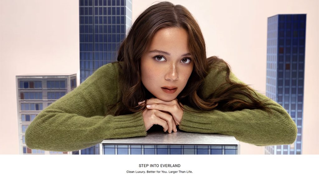
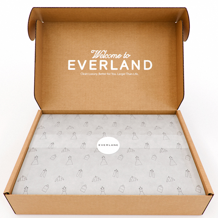
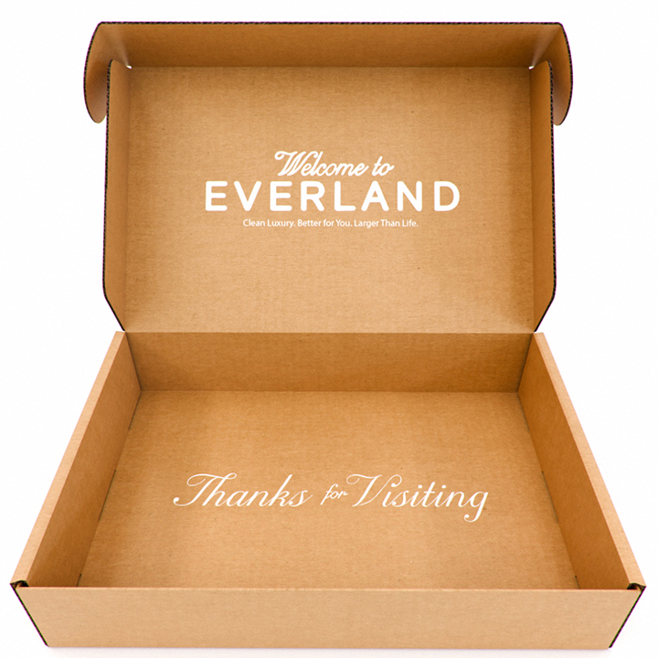
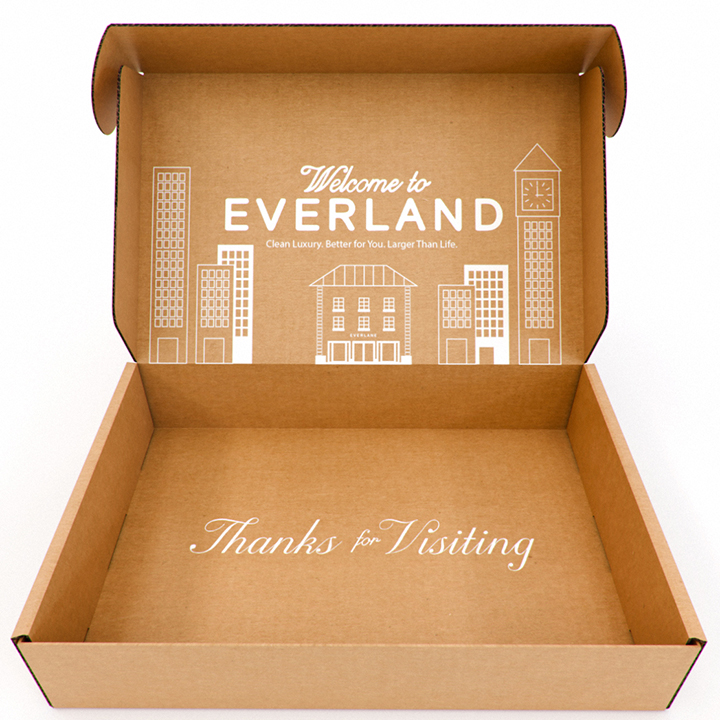
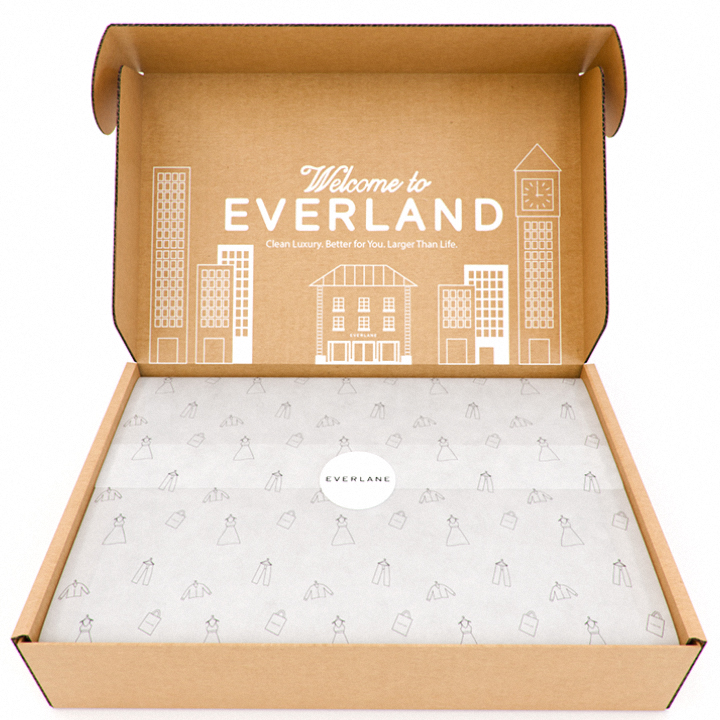
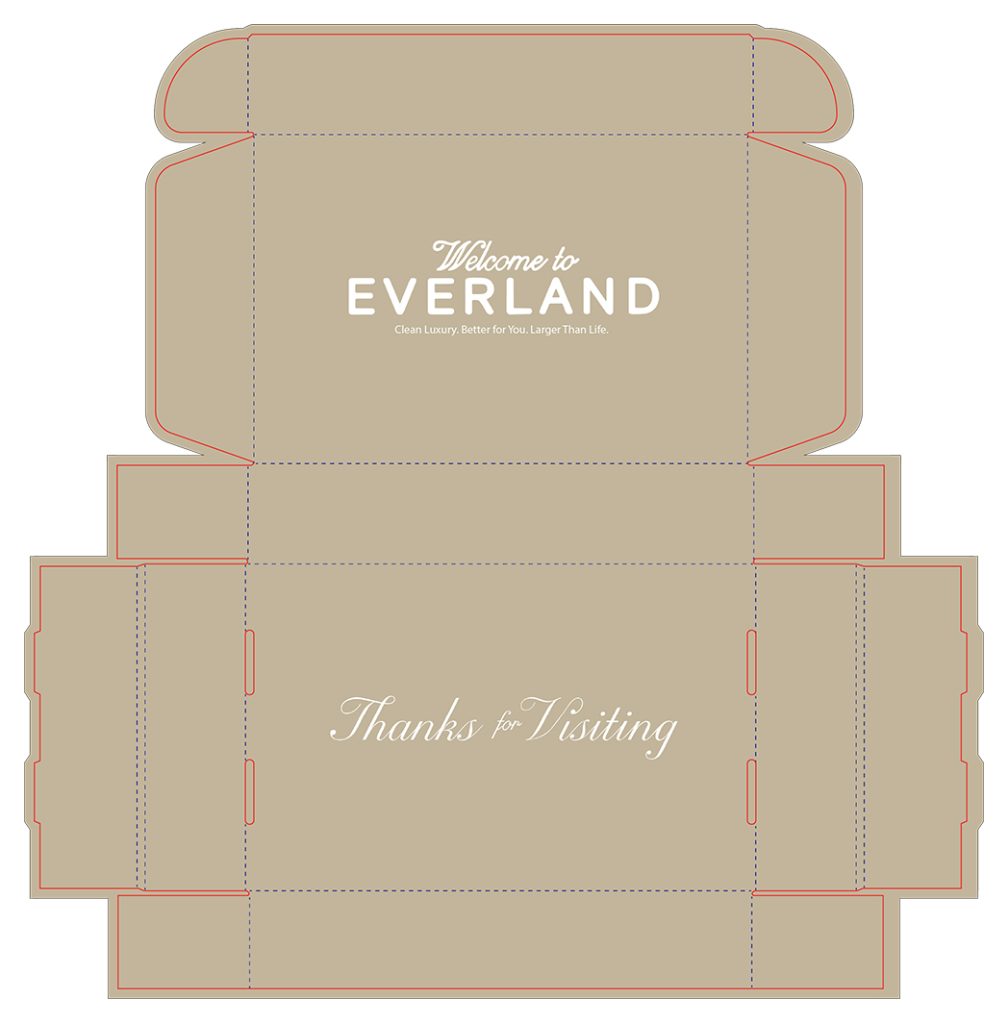
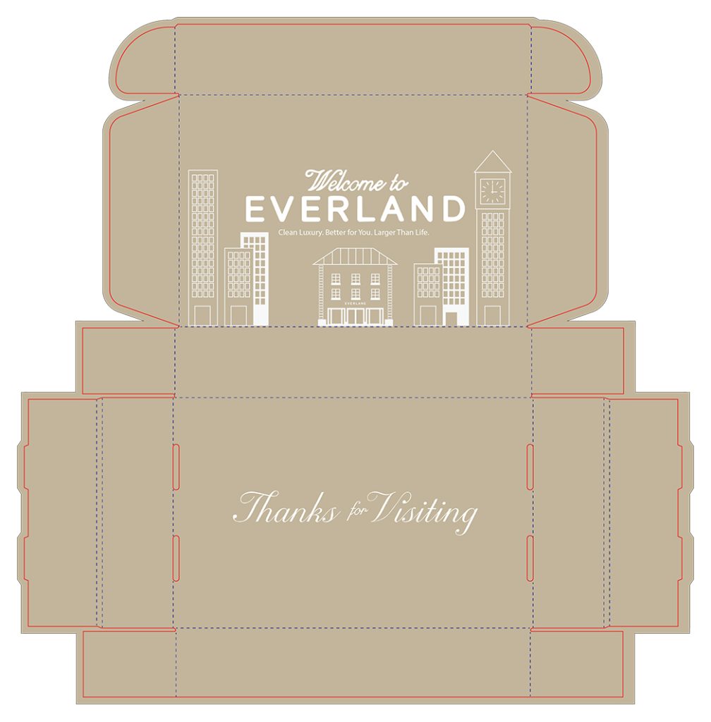
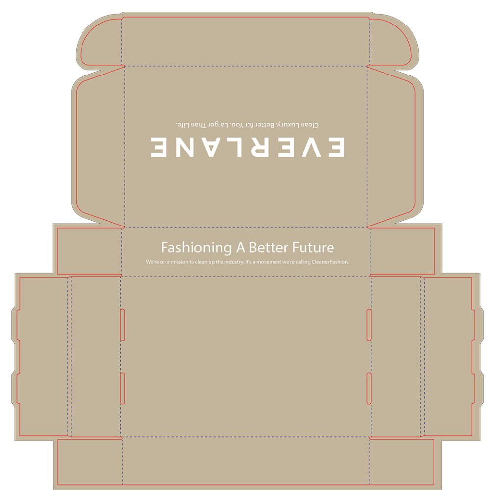
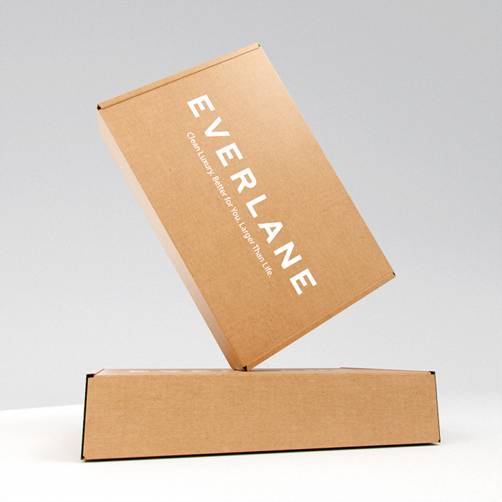
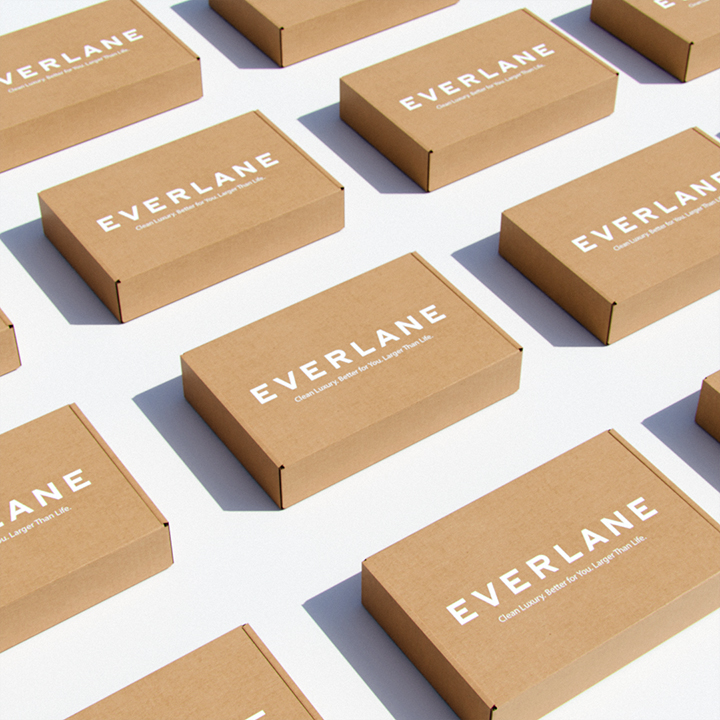
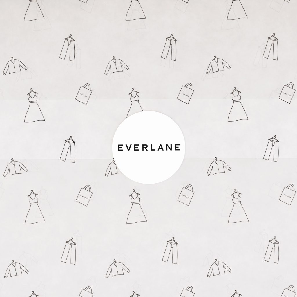
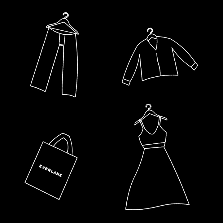
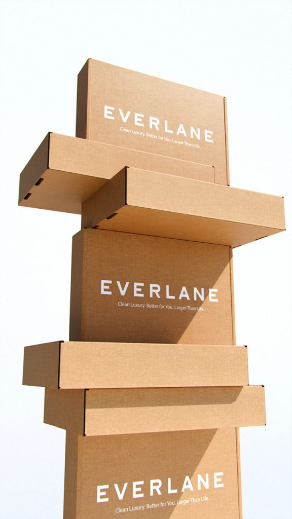
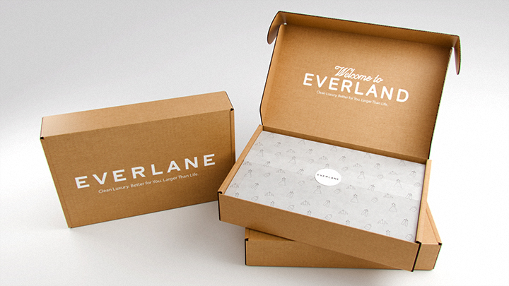
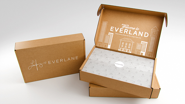
I drew inspiration from Everlane and their new “Everland” campaign with artist Laufey, aiming to translate its fresh, creative vibe into an eco-friendly mailer box. My goal was to design packaging that not only feels connected to the campaign’s spirit but also aligns with Everlane’s ongoing commitment to sustainability. By focusing on responsible materials and clean, minimal details, I wanted the box to embody their “Cleaner Fashion” mission.